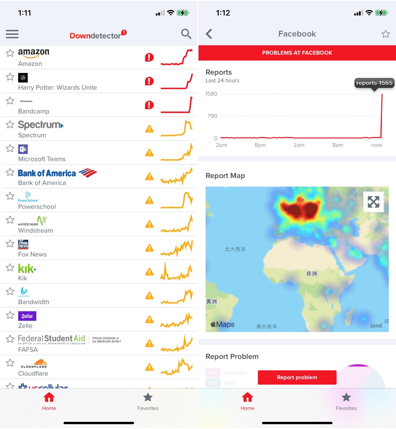
Most people treat the service outage map as a scientific instrument, a digital barometer that tells them exactly when the internet has finally broken, but the truth is that Downdetector is less of a thermometer and more of a panicked town square. We’ve come to believe that when the little red spike on the graph climbs, the service in question is suffering from a catastrophic failure. This is almost never the whole story. You’re not looking at a technical diagnostic tool; you’re looking at a popularity contest fueled by collective frustration.
When you click that button to report an outage, you aren't performing a network diagnostic. You're venting. The entire mechanism relies on the assumption that a surge in user complaints correlates perfectly with a surge in server-side failures. That assumption is flawed because it treats every user as a reliable sensor. If you're a heavy gamer in New York and your connection jitters, you report a problem. If a thousands-strong server cluster in Virginia experiences a micro-second of packet loss, the effect is the same on your screen, but the causes are miles apart. The system doesn't distinguish between a local ISP hiccup, a misconfigured router in your own basement, or a global server collapse. It simply aggregates the noise and calls it a signal.
The Myth of Precision in Downdetector
The danger here isn't that the tool is wrong—it's that it provides just enough truth to make its inaccuracies dangerous. If you’re a sysadmin for a mid-sized firm, you might rely on these trends to decide whether to switch your team to a backup service. If you act because you see a spike, you’re making a business decision based on the temperamental mood of a population that is currently staring at a loading screen and screaming at their monitors. You’re not measuring technical reality; you’re measuring the "frustration-per-second" metric of the internet.
This is why the data is inherently skewed toward consumer-facing platforms. A massive banking backend could be running at half-capacity, and you’d never see a spike because most users aren’t constantly poking at their bank’s landing page. Conversely, if a popular social media app has a momentary interface bug, the report count goes vertical within seconds. It’s a measure of reach, not reliability. The system works by comparing incoming reports to a calculated baseline, but that baseline is a guess at best. It’s an attempt to turn chaos into a clean, predictable curve. Human behavior isn't predictable, and neither is the "outage" you think you’re tracking.
Skeptics will argue that the sheer volume of data acts as a filter, smoothing out individual errors to reveal the real fire. They claim that if ten thousand people are reporting a problem, there is undeniably a problem. This is the common defense for crowd-sourced monitoring. Yet, it ignores the herd effect. One person notices a minor slowdown and tweets about it; the internet hive mind swarms the site to check for status updates. The platform then records those status-checkers as "reports," creating a self-fulfilling prophecy of an outage where only a minor performance hiccup existed. You’re watching an echo chamber get louder, not a network infrastructure fail.
Why You Can’t Trust the Crowd
The technical reality is that infrastructure providers don’t use these tools to monitor their own health. They have internal dashboards that track actual packet latency, error codes, and server load. When you use this site to check if "the internet" is down, you’re relying on the collective intelligence of people who are, by definition, currently experiencing a problem that is likely specific to their own local environment or device. It’s like asking a room full of people in the dark why the lights are out, when the reality is that they’re all just wearing different colored sunglasses.
True technical monitoring is boring. It involves looking at logs, trace routes, and server heartbeat signals. It doesn't involve a map with red dots or a comment section where users argue about whether their Wi-Fi is acting up. The issue is that we have become addicted to the immediacy of this information. We want a status update that matches our emotional state. We want to know that someone else is suffering so we don't feel like the only one whose connection failed at a critical moment. It satisfies a psychological need for validation far more than it satisfies the need for objective data.
I’ve spent years watching service disruptions across the industry, and the most reliable status updates always come from the source, or from neutral third-party infrastructure monitors that look at traffic volume rather than user complaints. Relying on consumer-reported data for infrastructure health is like asking passengers on a plane to diagnose the engine noise. They might feel the shudder, and they might even be right that something is wrong, but they don't have the tools to tell you what part of the plane is failing or why.
You’ll continue to use these tools, and they’ll continue to give you that familiar sense of knowing. But next time the graph spikes, pause. Consider that what you’re really seeing isn’t a breakdown of the machine, but a reflection of a thousand people reaching out to confirm they aren't alone. You’re staring at the digital equivalent of a group of people standing on their porches, looking at the streetlights, and wondering if anyone else’s house is dark too. It’s not a diagnostic report. It’s a collective nervous twitch. The next time you see a surge, remember that you’re looking at a crowd, not a data point. Stop letting the panic of the masses define the state of your reality.